Social media image sizes in 2026: a simple cheat sheet
The sizes and shapes that look right on Instagram, Facebook, WhatsApp, YouTube and LinkedIn, and why designing at the correct size matters.
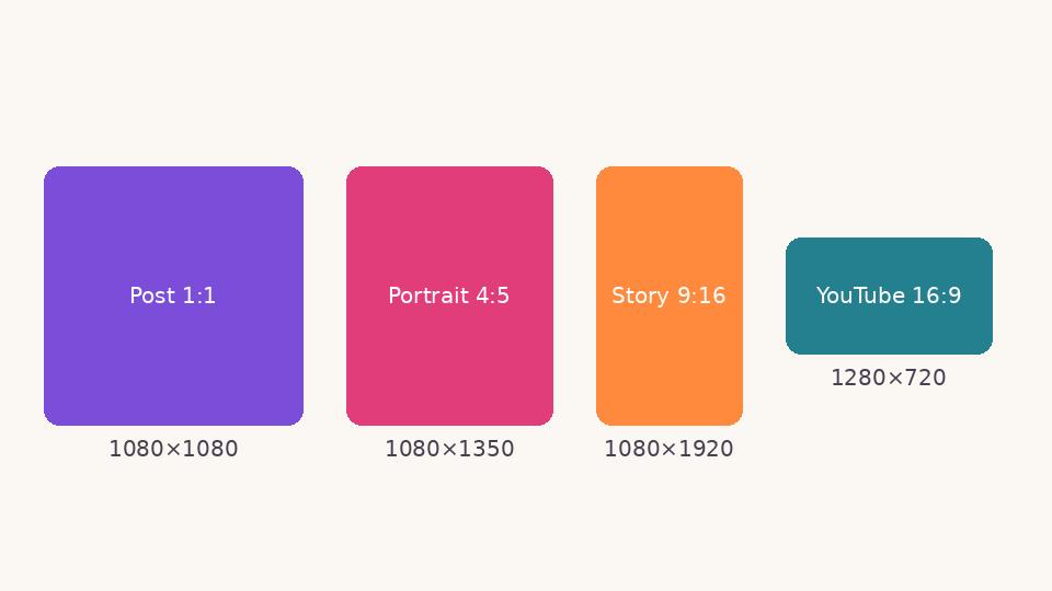
A design that looks perfect on your laptop can be cropped badly the moment you post it. Each platform shows images in its own shape, and if yours does not match, the app cuts off the edges or shrinks the image with empty bars. Designing at the right size from the start avoids both problems.
The four shapes that cover almost everything
| Shape | Recommended size | Where it fits |
|---|---|---|
| Square 1:1 | 1080 × 1080 px | Instagram and Facebook feed, WhatsApp images, profile grids |
| Portrait 4:5 | 1080 × 1350 px | Instagram and Facebook feed; takes more screen space than square |
| Vertical 9:16 | 1080 × 1920 px | Stories, Reels, WhatsApp status, YouTube Shorts |
| Wide 16:9 | 1920 × 1080 px (or 1280 × 720) | YouTube thumbnails and videos, presentations, TV screens |
Platforms change their layouts from time to time, so check the platform's own help pages before a big campaign. These shapes, however, have stayed stable for years.
Keep important things inside the safe area
Even at the right size, parts of an image are covered by buttons, captions or profile pictures. On a 9:16 story, keep text and faces out of the top 250 pixels and the bottom 300 pixels, where the app places the profile name and the reply box. On a YouTube thumbnail, the bottom-right corner shows the video length, so do not put your key word there.
Why not just make one big image?
A huge image does not look sharper on a phone; the app compresses it to its own size anyway. Worse, if the shape is wrong, the platform crops it. A 1080-pixel-wide image is the sweet spot for most feeds: sharp on high-resolution phones, small enough to upload quickly.
Text size that survives a phone screen
Most people see your post on a phone held at arm's length. As a rule of thumb, the main heading on a 1080-pixel square should be at least 70–90 pixels tall, and supporting text at least 36 pixels. If you need to zoom in to read it, so will your audience.
One design, many sizes
Rather than squeezing one layout into every shape, start from the content: the heading, one image, the logo. Then arrange it again for each size. In Kreeato's Festival Library, for example, each design can be opened as a square post, a story, a wide banner or an A4 print, and the layout rearranges itself to fit each shape.
Quick checklist before you post
- Is the canvas the right shape for where it will appear?
- Is the main message readable on a phone?
- Are faces and text away from the edges?
- Did you export PNG for text-heavy graphics and JPG for photos?
Put it into practice
Kreeato runs in your browser. Nothing to install.
More from Kreeato
All blog →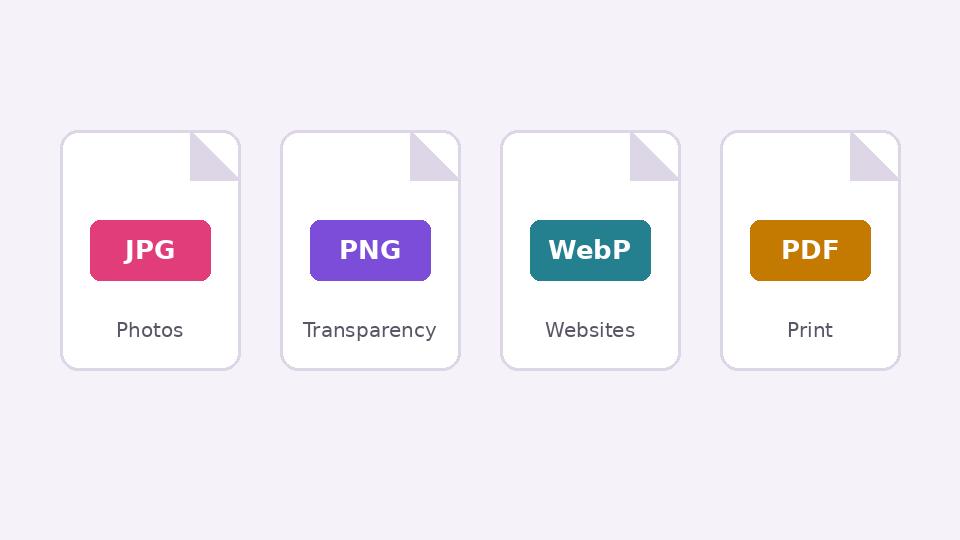 Basics
JPG, PNG, WebP or PDF? Choosing the right format when you export
What each image format is good at, when transparency matters, and how to keep files small without making them look worse.
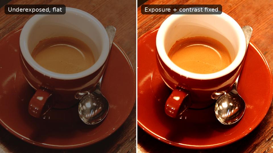 Photo editing
Exposure, contrast, highlights and shadows: a beginner's guide
What the four most-used light sliders actually do, the order to use them in, and how to avoid the overdone look.
 Tutorial · Photo
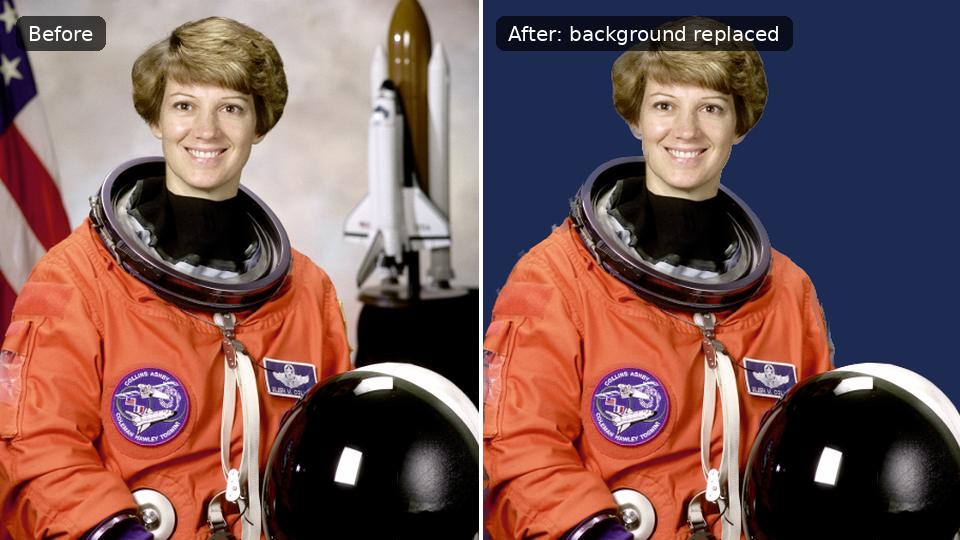
How to remove the background from a photo in Kreeato
Cut out a person or product in one click, keep only the object you selected, clean up the edges and export a transparent PNG.