Seven tips for festival greetings that look professional
Typography, colour, contrast, language and layout tips for Diwali, Eid, Christmas, Holi and Gurpurab greetings that read well on a phone.
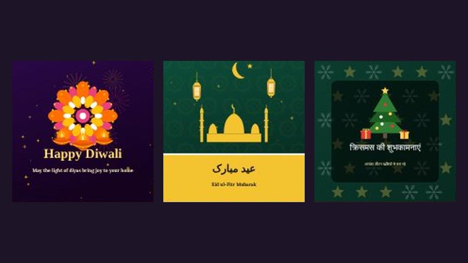
Festival greetings are among the most shared images in India. Businesses send them to customers, families send them to relatives, and many are forwarded dozens of times. A few design choices decide whether yours looks polished or crowded.
1. One message, said clearly
A greeting has one job: "Happy Diwali from us". Put the festival name biggest, your name or brand second, and at most one short line of wishes. Long paragraphs, phone numbers and offers all at once compete with each other, and on a phone nothing gets read.
2. Contrast before decoration
Gold text on a yellow background or white text on a pale sky looks elegant on a big screen and disappears on a phone in sunlight. Make sure the text is clearly darker or lighter than what is behind it. If the background is busy, put the text on a plain band or card.
3. Respect each festival's mood and colours
Diwali suits warm golds, deep purples and the glow of diyas. Eid greetings often use greens, deep blues and gold with the crescent moon and lanterns. Christmas uses red, green, gold and snow; Easter uses soft spring colours, lilies and decorated eggs. Good Friday is a solemn day of remembrance, so a quiet, respectful design with a cross or dove suits it better than confetti and balloons, and "Blessed Good Friday" is more appropriate than "Happy Good Friday".
4. Write in your audience's language
A greeting in Hindi, Urdu, Punjabi, Tamil or another language your audience reads feels personal. Use a proper font for the script; do not stretch an English font or type a script you cannot check. If you are unsure of the spelling, ask someone who reads it daily. A wrong letter in a greeting is noticed instantly.
5. Choose at most two fonts
A decorative font for the festival name and a simple, readable font for everything else is enough. Script fonts look graceful in a heading but become hard to read in small sizes.
6. Leave breathing space
Keep a margin of about 5–8% of the width around the edges. Apps crop slightly, and some phones round the corners of images. Empty space also makes a design look calmer and more expensive.
7. Make the brand subtle
If you are a business, put your logo small in a corner or at the bottom. People share greetings that feel like greetings, not adverts. A good greeting with a small logo travels much further than an advert with a big one.
A shortcut
Kreeato's Festival Library starts you with a balanced layout for each festival, with the text already separated into editable layers, so you only need to change the words.
Put it into practice
Kreeato runs in your browser. Nothing to install.
More from Kreeato
All blog → Social media
 image sizes in 2026: a simple cheat sheet
The sizes and shapes that look right on Instagram, Facebook, WhatsApp, YouTube and LinkedIn, and why designing at the correct size matters.
 Basics
JPG, PNG, WebP or PDF? Choosing the right format when you export
What each image format is good at, when transparency matters, and how to keep files small without making them look worse.
 Tutorial · Basics
Open and save your designs with Google Drive, OneDrive or Dropbox
Link a cloud storage account so you can open photos from it and save your finished work back, without downloading files first.