Putting text on images: hierarchy, fonts and readability
Make posters, posts and thumbnails easy to read at a glance: what to make biggest, how many fonts to use and how to place text on busy photos.
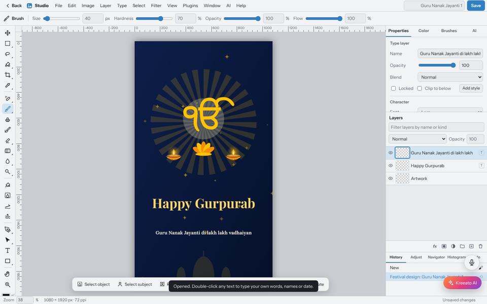
People look at a post for about a second before deciding whether to stop scrolling. In that second they must understand what it is about. Good typography is less about beautiful fonts and more about making the important words impossible to miss.
Decide the order of importance
Before designing, write down the text and number it by importance. For a shop offer it might be: 1, "Diwali Sale 30% off"; 2, the dates; 3, the shop name; 4, the address and phone number. Then make the sizes follow that order. The first item should be clearly the biggest, often two to three times the size of the second.
Cut the words
Every extra word makes the others smaller. "Grand Diwali Mega Sale Offer – Hurry, Limited Period Only!" says the same as "Diwali Sale". Put the details in the caption, not on the image.
Two fonts are enough
- One display font for the headline, which can have character: bold, condensed, script or decorative.
- One simple, readable font for everything else.
- Use weight (bold, regular) and size to create variety, rather than adding a third font.
Script and very thin fonts look elegant in large sizes but become unreadable when small. Keep them for the headline.
Text on busy photos
Text on top of a detailed photo is the most common readability problem. Some reliable fixes:
- Place text on a calm area of the photo, such as the sky, a wall or empty table space.
- Add a band or box behind the text, in a solid colour or a semi-transparent dark layer.
- Darken or blur the photo slightly behind the text with an adjustment layer and a mask.
- Add a soft shadow under white text. Keep it subtle: a hard, offset shadow looks dated.
Alignment and spacing
Choose one alignment for a design, usually centred for greetings and posters, left-aligned for longer text. Keep equal space between related lines and more space between groups. Leave margins: text that touches the edge of the image looks cramped and may be cut off by the app.
Languages and scripts
Hindi, Urdu, Punjabi and other scripts need fonts designed for them. Devanagari letters with matras need more line spacing than English. Urdu reads right to left, so check that punctuation and numbers sit where readers expect. If possible, ask a native reader to check the text before you publish.
Test at real size
Zoom out until the design is the size it will appear on a phone, or send it to your own phone. If you have to squint at the main message, make it bigger or remove something else.
Put it into practice
Kreeato runs in your browser. Nothing to install.
More from Kreeato
All blog →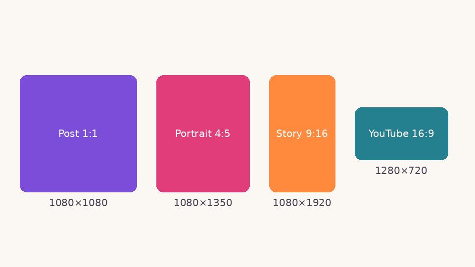 Social media
 image sizes in 2026: a simple cheat sheet
The sizes and shapes that look right on Instagram, Facebook, WhatsApp, YouTube and LinkedIn, and why designing at the correct size matters.
 Basics
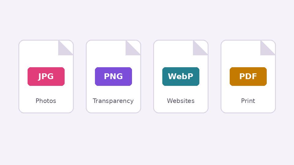
JPG, PNG, WebP or PDF? Choosing the right format when you export
What each image format is good at, when transparency matters, and how to keep files small without making them look worse.
 Tutorial · Video
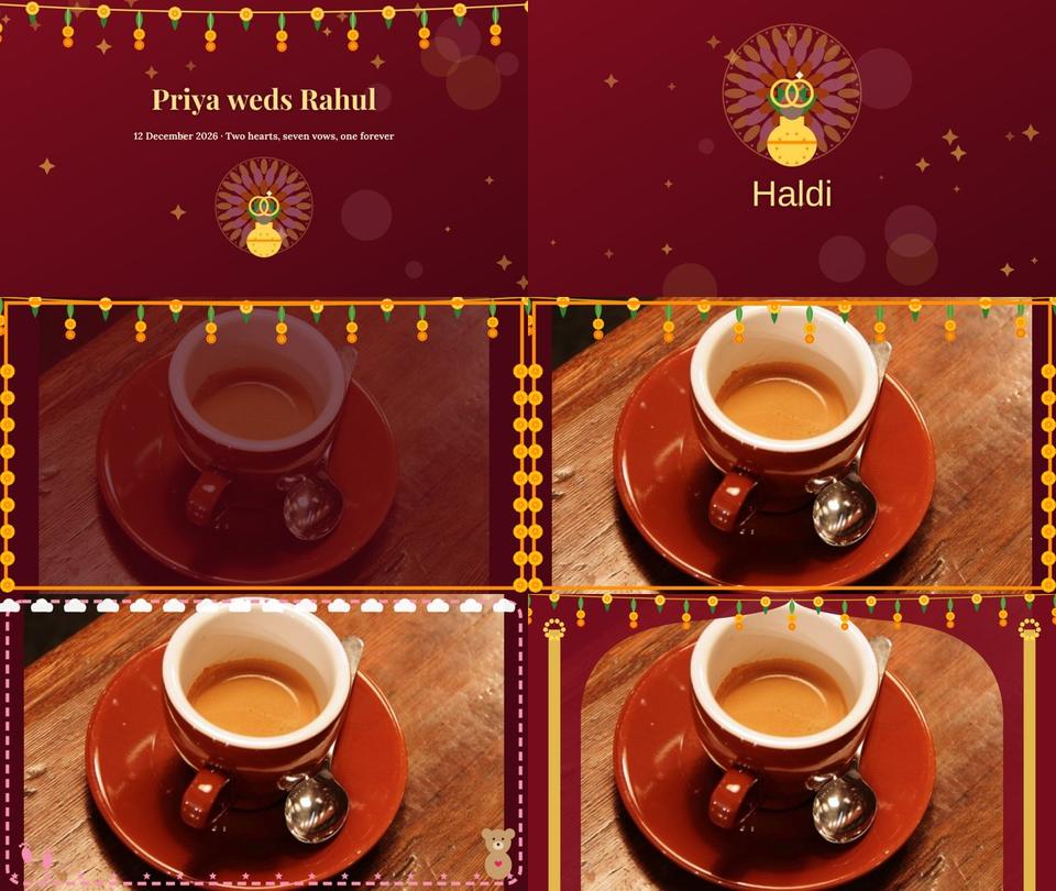
Create a wedding, Nikah or baby slideshow video from your photos
Use Smart Slideshow to turn photos into a video with names, chapter cards, slow zoom, transitions, a frame and music, then export it.