Choosing colours for your brand and your designs
How to pick a small colour palette that looks professional, works in print and on screen, and stays readable for everyone.

Colour is the first thing people notice and the first thing they remember. A consistent palette makes a small shop look established; a different set of colours on every post makes it look improvised. You do not need design training to choose well, just a few rules.
Start with fewer colours
Most strong brands use one main colour, one or two supporting colours and neutrals (white, black or grey, and perhaps a cream). That is enough for posters, posts, menus and packaging. Every extra colour makes the next design harder to keep consistent.
The 60-30-10 idea
A simple balance used by interior designers works for graphics too: about 60% of the space in a neutral or background colour, 30% in a supporting colour and 10% in the accent colour that should catch the eye, such as the offer, the button or the price. If everything is bright, nothing stands out.
Where to find a palette
- From your product or shop. The colour of your signboard, your packaging or your best-selling product is a natural starting point.
- From a photo you love. Kreeato's Capture app can pull a palette of colours from any photo.
- From meaning. Greens often suggest nature, health and freshness; blues suggest trust and calm; reds and oranges feel energetic and are common for food and sales; purples and golds feel premium. These associations vary between cultures and contexts, so treat them as a starting point, not a rule.
Contrast keeps text readable
Text must stand out clearly from its background. Dark text on a light background, or white text on a dark one, is safest. Mid-tones together, such as orange text on red, or grey on light blue, are hard to read, especially on phones outdoors and for people with low vision. The Web Content Accessibility Guidelines recommend a contrast ratio of at least 4.5:1 for normal text; many free online contrast checkers will tell you the number.
Do not rely on colour alone
Some people cannot easily tell red from green. If a design uses colour to show something important, such as "available" and "sold out", add a word or an icon as well.
Screen colours and printed colours
Very bright screen colours, such as neon green or electric blue, cannot always be printed exactly and may come out duller. If you print often, test your main colour on paper early. Write down the exact colour codes (for example, #7B4DD8) so every designer and printer uses the same values.
Write it down
Once you have chosen, make a small one-page guide: your colours with their codes, your two fonts and your logo. Share it with anyone who designs for you. In Kreeato, you can store brand colours in the Assets app so they are one click away in every design.
Put it into practice
Kreeato runs in your browser. Nothing to install.
More from Kreeato
All blog →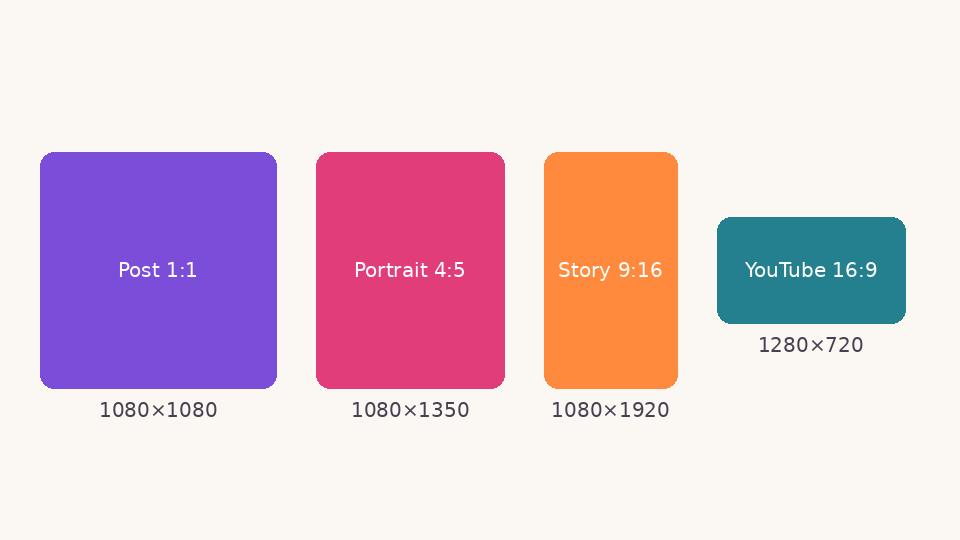 Social media
 image sizes in 2026: a simple cheat sheet
The sizes and shapes that look right on Instagram, Facebook, WhatsApp, YouTube and LinkedIn, and why designing at the correct size matters.
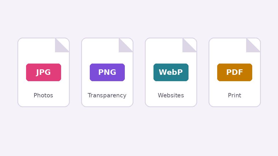 Basics
JPG, PNG, WebP or PDF? Choosing the right format when you export
What each image format is good at, when transparency matters, and how to keep files small without making them look worse.
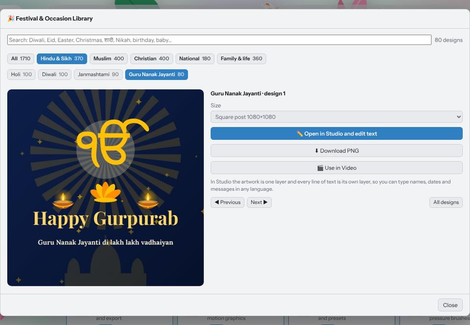 Tutorial · Design
Make a festival greeting in two minutes with the Festival Library
Pick a ready design for Diwali, Eid, Christmas, Holi, Gurpurab or a birthday, type your own words in any language and download it for WhatsApp or Instagram.